An International Take on Banking in the USA
Group Project
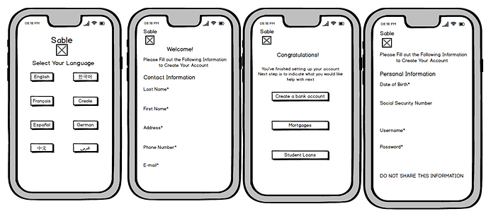
Our group chose to design a mobile application interface for the Sable app. We made this decision because the primary way users will interact with Sable is through the mobile interface.
About the Startup:
Getting set up with a bank is a slow process for people new to the U.S. It can take months for foreign-born people to get set up with a credit card and checking account. Sable launched a mobile bank for international people in the U.S. that aims to expedite that process . The team has collectively worked on distributed groups that have launched 14 banking products in the past . With Sable, users can get set up with a credit card and checking account online in five minutes. Sable is targeting 4.5 million credit worthy internationals, and an estimated $3.3 billion market in the U.S. alone. The team wants to eventually launch a suite of banking products such as mortgages and student loans.
Pre-Design Questions:
1. What group(s) of people will be directly impacted by the interface?
-
International Students & Foreigners (immigrants , green card holders , etc.): a Social Security Number is not required to open an account, which accommodates non-U.S. citizens.
-
Millennials: convenient application caters to this demographic, as an account can be opened at home and on their phone in minutes.
2. What group(s) of people will be indirectly impacted by the interface?
-
Federal Reserve, Office of the Comptroller of the Currency (OCC), Federal Deposit Insurance Corporation (FDIC): enforcing regulation to protect consumers.
-
Parents of college students as co-signers, Colleges: advising incoming international students on the American banking process.
3. How are these groups affected by the interface? What are some questions that the interface should address to ethically handle these effects?
-
Privacy and security of personal data: we've included a privacy policy before users open their account and we've designed the interface to not display virtual card numbers.
-
Transparency: users may be concerned about how much is being spent on their card, so we've included a transactions page for them to keep track of their expenses and erroneous purchases.
Why Iterative Design:
The goal of this project is to develop an extremely usable and visually appealing prototype of Sable’s mobile interface by iterating through cycles of designing, testing and analyzing, and then refining based on the analysis.
Our Iterative Design process has 4 main components: sketching, prototyping, gathering feedback from an in-class critique, and user testing. By going through these four stages, we began with Sable’s purpose and rough sketches, and ended with a usable and consistent prototype.
Sketches (4 Sets):
Set 1
Set 2

Set 3
Set 4
High Fidelity Prototype (Using Adobe XD):
After presenting each of our sketches to each other, we chose the screens that we wanted to incorporate into our high fidelity prototype. Our prototype is below and is interactive so play around with it yourself!
DESIGN JUSTIFICATIONS:
One of our important design choices was using teal as the color for the app because it is Sable's color. Though we could have changed it, we felt that the color was representative of the welcoming and easy interface and services that Sable wants to provide.
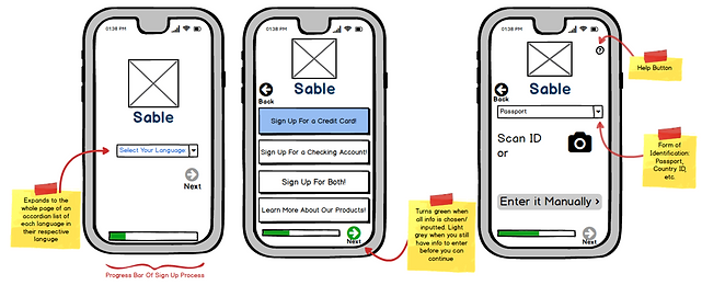
Because the company targets internationals, we felt it was important to include a language page as the initial screen when opening the app for the first time, so users can set up and use their account in the language they are most comfortable with.
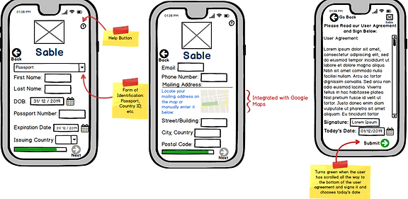
In our original sketches, we did not have a Privacy Policy screen, but later felt it was important to include to create trust through transparency.
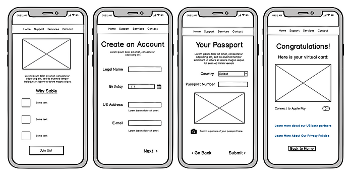
We didn't have many congratulation pages in our original sketches, but we included multiple with very welcoming language in our prototype to create an unintimidating mobile banking experience. Some of the feedback we received was to not include the user's virtual card upon opening the app in order to secure their privacy. This feedback helped redirect how we designed our Accounts Page to make users feel comfortable opening the app without worrying about someone looking over their shoulder and to allow users to instead see their transactions because their recent purchases and balance are often more relevant than card number information while on mobile.
In-Class Critique & Changes:
- Action buttons should be different color (not Sable teal)
-
Changed buttons from teal to green
-
-
Accent circles
-
Addition of a darker color
-
-
Credit card number should be hidden for security
-
Removed credit card image entirely; only showed number on credit card signup success page
-
-
Have Accounts Page only show balance and greeting
-
We did just that
-
User Testing:
Hypothesis: We hypothesize that all of our participants will be able to get the account balance page, since the only way to get to that page is by creating a line of credit.
We tested 3 users in usertesting.com and gave them the following instructions:
Scenario:
Pretend you are an international student who wants to open a line of credit with Sable banking app. Please choose English as your language. Do not stop until you see a "Congratulations" page with an image of your credit card. Do not input any personal information. Click to agree to user privacy agreement box to continue.
Tasks:
-
Were you able to successfully choose a language? What do you think of the design of the app so far? Continue onto the next task after verbally answering the questions.
-
Were you able to get to the page that says "Welcome to the Sable Family"? If so, what do you think of the sign up process? If not click on "Join Us" and continue on to the next page.
-
Were you able to open a new line of credit and reach the "Congratulations" page with the image of the card? If not, continue until you do. If so, what do you think of the process of opening a line of credit? Would you trust this app with your information?
Analyzing Results:
QUALITATIVE ANALYSIS:
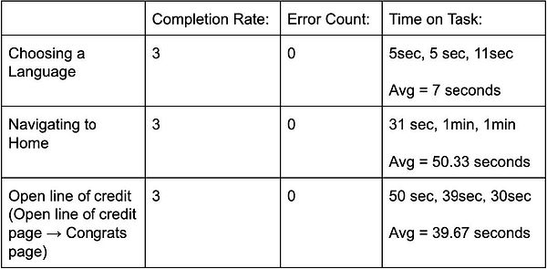
The first thing that's pretty notable from our user testing data is that there is a 100% task completion rate and a 0% error count. Therefore, this sample of data backs up our hypothesis, and also shows that users had a relatively easy and error-free experience.
From the time data, we see that tasks generally aren't taking too long for users to complete, especially as a portion of the time is spent on talking aloud. After totaling the averages, it seems that Sable's claim of being able to open an account in "five minutes" is true.
From direct user feedback, the general consensus is that the app is designed consistently, intuitively and accessibly. There was a comment about the basicness of the design, however.
But, the main criticism was about the security and trustworthiness of the app. We thought that including the Privacy Policy could help alleviate security concerns, but it seems our interface can do more in that department. Some user suggestions were including a Contact Us page, double-authentication, and explicitly saying what we do for security.
USER FEEDBACK:
-
The app was ok, but a little basic
-
Button color contrast was great
-
"I would need to do outside research to trust them."
-
Design of the app is very well organized
-
Clean and easy to read design, text was big enough to read
-
Would not trust the app because the interface did not include backup security measures (double verification and/or security questions)
-
Doesn't require social security number (good thing)
-
The opening line of credit process was very easy
Next Steps:
Possible Interface Changes & Areas of Improvement:
-
Security: the common criticism of all of our testers was the Sable's security: our current prototype didn't instill a lot of trust. Possible changes are including a Contact Us Page that includes a 24/7 Help Line, double-authentication, security questions, more explicit text (not just in the Privacy Policy because users are likely to read) about Sable's security measures, third party comments about credibility, and clear information about Federal Departments that insure and regulate Sable.
-
Guidance: one user suggested adding a pop-up help box or a video tutorial for extra guidance during the sign up process to ensure clarity and credibility.
Unexpected Challenges & SuccessFul Methods:
- Challenges: in our first round of user testing (not included in write-up because it gave invalid data), our instructions were not very clear on how to navigate the pages, so users got stuck on the input pages. One user used their browser navigation arrows to navigate our pages instead of our navigation buttons and our pages got mixed up.
- Successes: after the first unsuccessful round of testing, we changed our instructions to be very explicit and very clear. The next round (included in the write-up) gave valid results that also happened to back up our hypothesis.
Take Aways:
-
About Iterative Design:
-
Iterative Design is an efficient and practical method to advance a designer's process.
-
We started with Sable's values and our lo-fi sketches, and through cyclical feedback, we were able to move towards an interactive prototype that addressed previous concerns.
-
-
About User Testing:
-
User Testing is a useful way to get a pair of fresh eyes on your design
-
User Testing provides tons of frank feedback, suggestions and a good look into a user's mental model
-
-
About This Interface:
-
A lot is going right, including the ease of task completion, intuitive design and fulfilling Sable's mission
-
Security and user trust can be improved a lot, however. The above suggestions may significantly help with this concern
-